[ad_1]

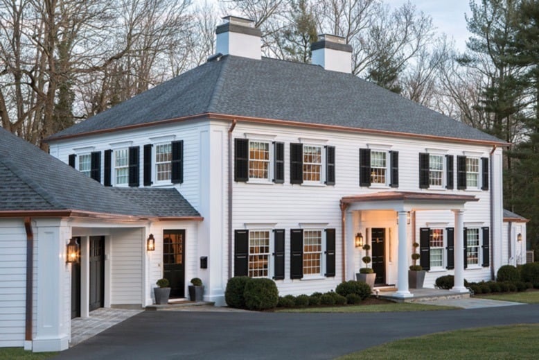
The refreshed façade of this Princeton home includes a new covered porch and copper accents. “We were very careful how we placed the copper so the downspouts don’t conflict with the big columns in the corners,” notes architect Marc Brahaney. Photo by Tom Grimes
The exterior of Chris and Debbie Sugden’s residence in Princeton, New Jersey, didn’t need a complete overhaul, but a bit of a facelift was in order. The siding was showing its age and the overall appearance needed an update. To spruce up their home’s façade, the Sugdens called on Marc Brahaney, owner of Princeton-based Lasley Brahaney Architecture + Construction.
Design NJ: What is the architectural style of this house?
Marc Brahaney: This is a colonial built in the 1950s. If you look back at past styles, this home fits in the “Adam” colonial house category. It’s reminiscent of architecture dating from the late 1700s to early-to-mid 1800s. Elements of this style include a symmetrical exterior with the entry door as the focal point, multiple pieces of trim around the front door including a fan-shaped window or wood panel above the door, individual double-hung windows that are not ganged together and that align both vertically and horizontally with panes of glass divided by muntin bars (small strips of wood), shutters and two to four chimneys. This is a builder version of what colonial architecture looked like at the time colonial was original to this country.
DNJ: What was the impetus behind the project?
MB: The pre-renovation house was dressed up with shutters, with trim at the front door and with large pieces of trim at the corners that were meant to mimic a giant order of columns. Other than that, it was fairly plain and unadorned. It was a little bit like a blank slate and it was fine; but the owners had reached the point where they needed to refurbish the exterior. The siding needed some maintenance and replacement. The shutters weren’t in good shape. The windows, which were original to the home, were not operating well. The owners took the need to do some significant maintenance as an opportunity to reconsider how they wanted the house to look. That led them to call us and ask us about options.
DNJ: What was the scope of the project?
MB: A fair amount of the siding had deteriorated badly, so we replaced those portions in keeping with the look of the existing siding. The project also involved adjusting the nature, proportions and detail of the trim, while working within the constraints of the mass of the house. For example, the giant columns on the corners were just flat board. We added new columns with a recessed panel for interest. Along the tops of the windows, we incorporated elaborate trim.
We also replaced the garage doors, which were okay but kind of tired. They weren’t on a par with what we were doing with the rest of renovation. That’s always a challenge with a project—knowing where to stop the level of intervention. You don’t want a situation where you do a lot of work but leave 25% of what was there. That can make the new elements look unfinished.
The biggest change was the addition of a covered porch on the front of the house. That was designed to take what was a very flat and plain massing on the front and fine-tune and modulate it by adding a significant front porch. It really enhances the look of the house.
[ad_2]
Source_link

